The Japan IP High Court has ruled in favor of Hermes in a dispute over the validity of Design Reg no. 1606558 by finding a likelihood of confusion with Hermes.
[Court case no. Reiwa5(Gyo-ke)10113, decided on February 19,2024]
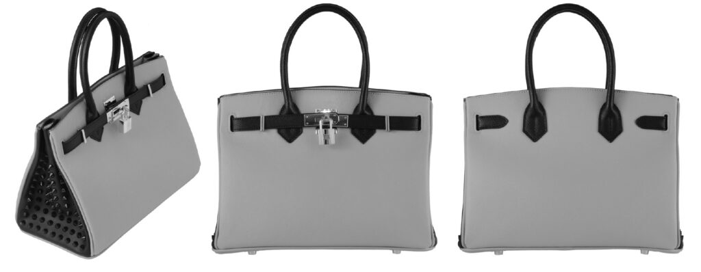
Design Registration no. 1606558
Plaintiff, Toms and Collective Co., Ltd applied a 3D shape of bag (see below) with the JPO on August 23, 2017 (Design App no. 2017-18064). The JPO, as a result of substantive examination, granted protection of the design on May 18, 2018.
Defendant, Hermes International filed an invalidation action with the JPO on January 13, 2023 and claimed the design registration shall be invalidated in contravention of Article 5(ii) of the Japan Design Law.
Article 5(ii) provides a design that has a risk of causing confusion with goods of another person’s business may not be registered.
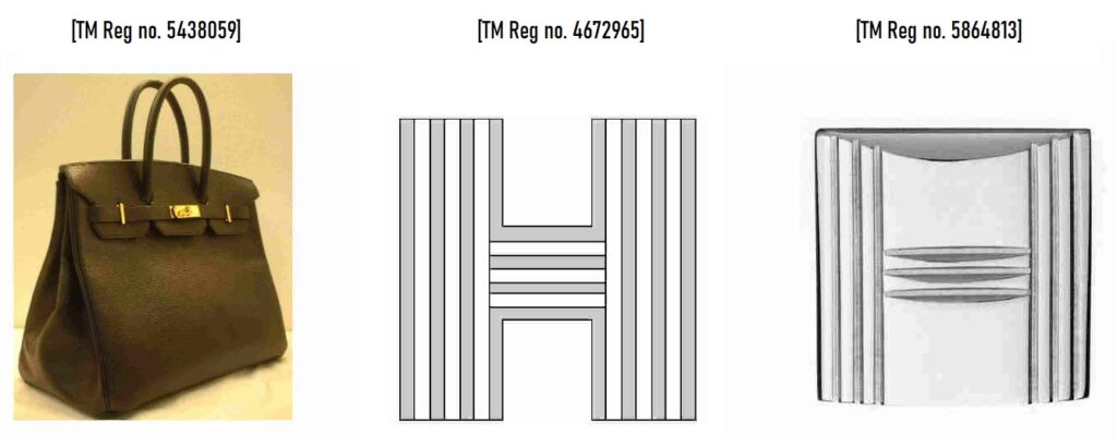
Hermes referred to three trademark registrations that are relevant to the 3D shape of Birkin bags (TM Reg no. 5438059) and two “H” logos (TM Reg nos. 4672965 and 5864813) in class 18. They argued that the disputed design is likely to cause confusion with Hermes when used on bags due to the famousness of the registered marks and the resemblance between the disputed design and Hermes’ marks.
Invalidation decision by JPO
On September 4, 2023, the JPO Trial Board decided to invalidate the disputed mark by stating that:
- As there is a remarkable gap between the disputed design and 3D shape of Birkin bags, the Board has no reason to find a likelihood of confusion with TM Reg no. 5438059.
- The Board questions whether the “H” logo for TM Reg no. 4672965 (H1 mark) has become famous as a source indicator of Hermes. Therefore, the disputed design would not cause confusion with H1 mark.
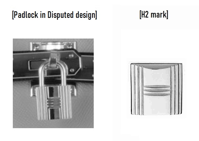
- Meanwhile, Meanwhile, the plaintiff admits that the ‘H’ logo for TM Reg no. 5864813 (H2 mark) has become famous for identifying Hermes. The padlock in the disputed design bears a resemblance to the H2 mark that has been used on the buckles of Hermes bags. As a result, relevant consumers are likely to confuse the bags with Hermes upon seeing the disputed design, particularly the padlock.
IP High Court decision
On October 11, 2023, the Plaintiff filed an appeal with the IP High Court and requested the cancellation of the invalidation decision made by JPO.
In the lawsuit, Plaintiff argued that the padlock should not be considered a prominent element of the design, as it is merely an accessory to the disputed design that represents a shape of the bag as a whole.
The judge stated that any partial shape of the entire design is subject to assessment in adapting Article 5(ii). It is unrelated to the “prominent element” used to assess design similarity under Article 3(1)(iii) of the Design Law.
The judge also addressed that it is irrelevant to consider whether Plaintiff promotes bags representing the disputed design but without the padlock.
Based on the foregoing, the court dismissed all allegations and invalidated the disputed design due to a likelihood of confusion with Hermes.