JPO Decision: the Volkswagen Beetle 3D shape Lacks Distinctiveness

The JPO Appeal Board affirmed the examiner’s rejection and decided to refuse IR no. 1379178 for the 3D shape of the Volkswagen Beetle due to a lack of inherent and acquired distinctiveness in relation to goods of classes 9, 28, and 30.

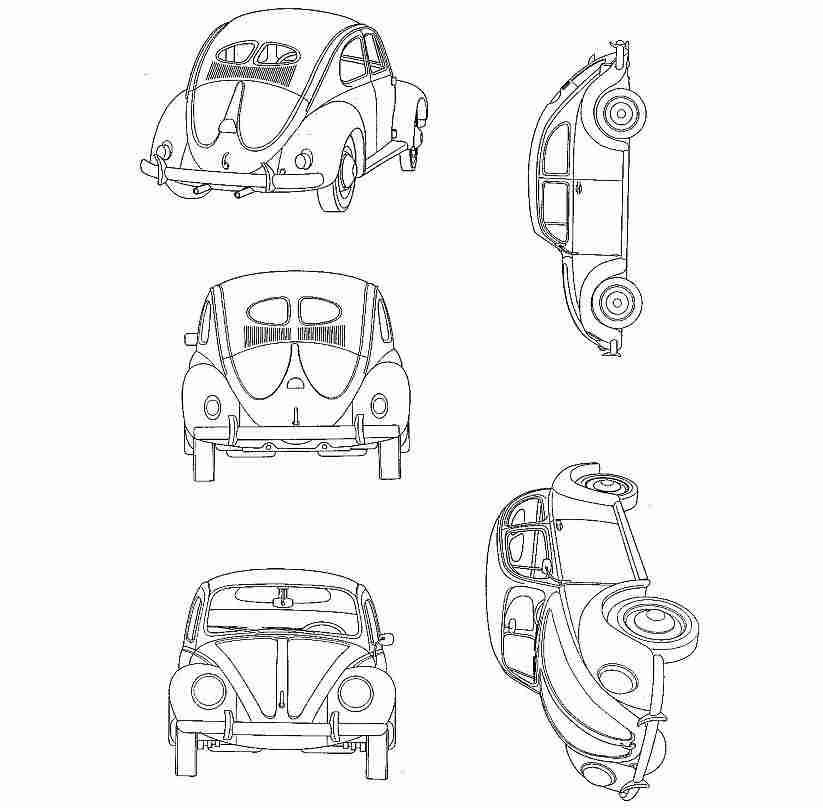
[Appeal case no. 2020-650030, Gazette issued date: January 27, 2023]

VW Beetle

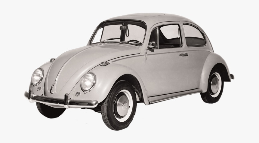
German car giant Volkswagen AG filed a 3D mark representing the iconic VW Beetle car (see below) in relation to various goods including navigation apparatus for vehicles [onboard computers], toy automobiles, scale model automobiles of classes 9, 28, and 30 with the JPO via the Madrid Protocol on December 7, 2017.

The JPO examiner rejected the mark in contravention of Article 3(1)(iii) and 4(1)(xvi) of the Japan Trademark Law on March 19, 2020, by stating that the mark merely represents a common shape of goods when used on toy automobiles, scale model automobiles of class 28 and chocolate and desserts, ice creams, frozen yogurts and sorbets of class 30, and consumers will misunderstand the quality of goods when used on other designated goods.


Appeal by Volkswagen

Volkswagen filed an appeal against the rejection on July 2, 2020, and argued the inherent and acquired distinctiveness of the 3D mark as a result of substantial use on VW’s automobiles (cl. 12) for more than six decades and around 21.5 million units cumulatively.


JPO Decision

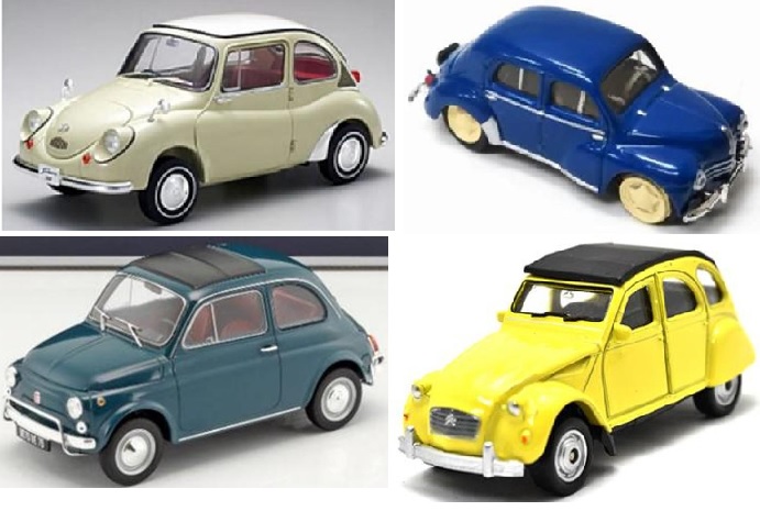
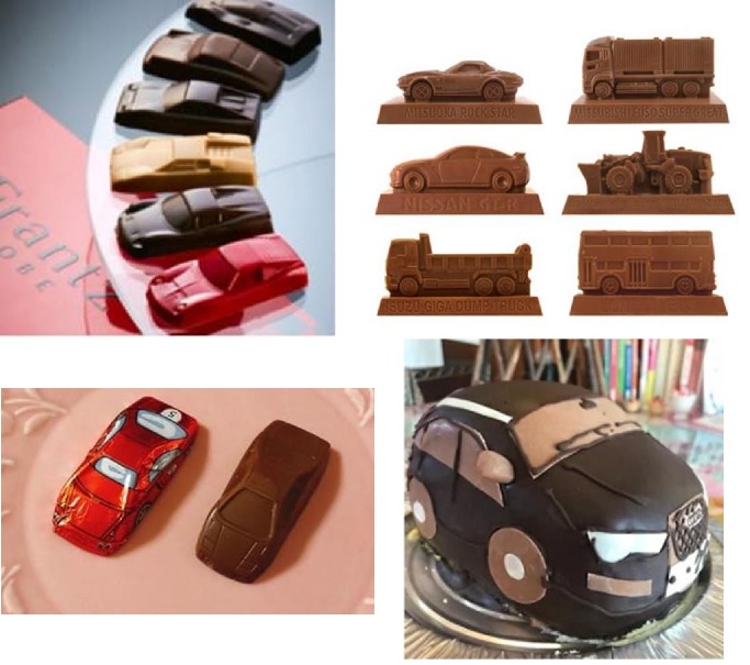
The Appeal Board at its discretion found plenty of goods in the shape of cars promoted for sale in relation to toy automobiles, scale model automobiles (cl. 28), and chocolate and desserts, frozen yogurts, and sorbets (cl. 30).

Bearing this fact in mind, the Board has a reason to believe the applied mark is adopted for a purpose of enhancing function or the aesthetic appeal of the goods in question. If so, the shape still remains within the scope of the descriptive shape of goods and shall be unregistrable due to a lack of inherent distinctiveness in relation to these goods.

Furthermore, the Board pointed out that Volkswagen stopped manufacturing cars in the shape of the applied mark in 2003. There is reasonable doubt that the 3D mark has been famous as a source indicator of VW cars after a lapse of twenty years. Besides, the applicant has not produced any evidence to demonstrate the actual use of the 3D shape on goods in classes 9, 28, and 30 and its sales.

Based on the foregoing, the Board found the 3D mark lacks inherent and acquired distinctiveness in relation to the goods in question and dismissed the appeal entirely.

Trademark Dispute over Side Stripe on Footwear

In a trademark dispute along the side of shoes between Vans Incorporated and Revenge X Storm Limited, the Japan Patent Office (JPO) did not side with Vans Incorporated.

[Invalidation case no. 2021-890049, Decision date: September 29, 2022]

REVENGE shoes

Revenge X Stream Limited filed a device mark representing a shoe for the right leg with a thunder-shaped line along the side of the shoe for use on ‘sports shoes’ in class 25 with the JPO on June 5, 2018.

The mark was successfully registered on October 2, 2020 (TM Reg no. 6299288).


Invalidation action by VANS

VANS INC. filed an invalidation action on September 16, 2021, and argued the mark shall be invalidated in contravention of Article 4(1)(x), (xi), and (xv) of the Japan Trademark Law by citing earlier trademark registrations for the iconic Vans Side stripe used on OLD SKOOL (see below) since 1977.

VANS alleged the appearance of Vans OLD SKOOL perse has become famous to indicate VANS’ shoes among relevant consumers of sports shoes in Japan.


JPO Decision

To my surprise, the JPO Invalidation Board denied a certain degree of reputation and popularity of the Vans Side stripe as a source indicator of VANS’ shoes from the totality of the produced evidence.

Besides, the Board negated the similarity of both marks by stating:

The mark in question represents a thunder-shaped sideline along the side of sports shoes. On the other hand, the Vans Side stripe consists of a gently wavy curved sideline along the side of the shoes.

Therefore, the appearance of the two marks clearly differs in the shape of the sideline on the side of the shoe and is clearly distinguishable.

In this way, even if both marks cannot be compared in terms of concept, they are dissimilar and unlikely to be confused in terms of appearance and pronunciation, and therefore, the degree of similarity shall be quite low.

Given a low degree of similarity between the two marks, the Board has a reason to believe that relevant consumers are unlikely to confuse a source of sports shoes bearing the mark in question with VANS.

Based on the foregoing, the Board found the entire allegations of VANS groundless and decided to dismiss invalidation action accordingly.

Failed Opposition by Chanel over Monogram

The Japan Patent Office (JPO) dismissed a trademark opposition filed by Chanel against TM Reg no. 6351256 for a composite mark containing a device made of two inverted and interlocked “C” by finding dissimilarity to and the unlikelihood of confusion with Chanel’s monogram.

[Opposition case no. 2021-900169, Decision date: September 30, 2022]

Opposed mark

The opposed mark consists of the words “MUSIC BAR” and “CHAYA”, and a device made of two inverted and interlocked “C” (see below).

HIC Co., Ltd. filed the opposed mark for use on restaurant service in class 43 on August 27, 2020, with the JPO. The examiner granted protection on January 19, 2022, and published for opposition on February 10, 2021.


Opposition by Chanel

Chanel filed an opposition on April 30 and argued the opposed mark shall be canceled in contravention of Article 4(1)(xi), (xv), and (xix) of the Japan Trademark Law by citing earlier trademark registrations for Chanel’s monogram on the ground that:

  1. The figurative element of the opposed mark is similar to the prestigious Chanel’s monogram made of two inverted “c” displayed as an ellipse in its central point (see below).
  2. Given the remarkable degree of popularity and reputation of Chanel’s monogram, relevant consumers with ordinary care are likely to confuse a source of the service in question bearing the opposed mark with CHANEL.
  3. Applicant must have applied the opposed mark, confusingly similar to Chanel’s monogram with an unfair intention to take advantage of the reputation and goodwill associated with Chanel’s famous trademark.

JPO Decision

The JPO Opposition Board admitted that Chanel’s monogram has acquired a high degree of reputation among relevant consumers of the service in question. Allegedly, CHANEL spent more than 5 billion JP-Yen on advertising in Japan each year since 2014. Annual sales revenue exceeds 50 billion JP-Yen. Jewelry accounts for 3 billion JP-Yen of the revenue.

In the meantime, the JPO denied visual similarity between the figurative element of the opposed mark and the monogram by stating:

They share a similarity in that they are both figures with two “C”-shaped curves placed back-to-back on the left and right sides so that parts of the curves overlap. However, in addition to differences in the way the “C”-shaped curves are represented (whether the thickness varies or is uniform and whether the opening is wide or narrow), there are also differences in the way the entire composition is represented, such as asymmetrical and symmetrical figures, vertical figures with two deeply overlapping curves and horizontal figures with two shallowly overlapping curves. Furthermore, the overall impression of the composition is clearly different in terms of asymmetrical and symmetrical figures, vertical figures with two curves deeply superimposed and horizontal figures with two curves shallowly superimposed. Therefore, there is no likelihood of confusion in terms of appearance.”

Obviously, there is no likelihood of confusion in terms of appearance and conception. Therefore, taking account of the impression, memory, and association given to traders and consumers by means of the appearance, concept, and pronunciation of two marks as a whole, the Board has a reason to believe that two marks are dissimilar and there is no likelihood of confusion.

Based on the foregoing, the Board dismissed the entire allegations of Chanel and allowed the opposed mark to register as the status quo.

MARC JACOBS Failed Trademark Opposition over J Marc

The Japan Patent Office (JPO) dismissed trademark opposition filed by Marc Jacobs Trademarks, L.L.C. against TM Reg no. 6462764 for an oval device mark due to dissimilarity to earlier registration for the J Marc logo.

[Opposition case no. 2022-900007, decided on August 24, 2022]

Opposed mark

ORPHE Inc., a Japanese business entity, applied trademark registration for an oval device mark (see below) to be used on goods and services in classes 9, 25, and 42, including computer software, PDAs, and footwear with the JPO on July 14, 2021.

The JPO examiner did not raise any objection in the course of the substantive examination and granted protection on October 19, 2021.

The mark was registered on October 27 and published for opposition on November 16, 2021.


Opposition by Marc Jacobs

On January 12, 2022, Marc Jacobs Trademarks, L.L.C. filed an opposition and alleged the opposed mark shall be canceled in relation to the designated goods of classes 9 and 25 in contravention of Article 4(1)(xi) of the Japan Trademark Law by citing IR no. 1282779 for the J Marc logo (see below), effectively registered on classes 3, 9, 14, 18 and 25 in Japan since 2017.

Article 4(1)(xi) is a provision to prohibit the registration of a junior mark that is identical with, or similar to, any senior registered mark.

Marc Jacobs argued both marks share the overall appearance consisting of two letters, “J” and “J”, combined in a way that constitutes an oval. A mere difference of direction (vertical or horizontal) would be anything but significant in assessing the similarity of marks because consumers would not consider the horizontal direction of the J Marc logo as a material factor to indicate the source. By taking into account of close resemblance in appearance and the same sound of “JJ”, the opposed mark shall be deemed similar to the J Marc.


JPO decision

The JPO Appeal Board stated both marks are sufficiently distinguishable for three reasons.

  1. The opposed mark has an impression of a rounded oval because of smoothly curved portions and shorter straight portions. On the other hand, the cited mark gives rise to an impression of a thin oval because of steeply curved portions and longer straight portions.
  2. Encircled blank of the cited mark also looks narrow due to an equal width with the surrounding oval lines. In the meantime, encircled blank of the opposed mark looks wider by virtue of the narrower width of an oval line.
  3. The cutout portion of the opposed mark gives the impression that the entire oval line is cut diagonally. The cited mark would never give such an impression to relevant consumers.

Taking into consideration the above findings, the Board had a reason to believe that relevant consumers are unlikely to consider, contrary to the opponent’s allegations, that both marks consist of two letters “J” and “J”. A mere coincidence of oval configuration is insufficient to find both marks similar in view of the remarkable distinctions of respective marks mentioned above.

Based on the foregoing, the Board concluded the opposed mark shall not be deemed similar to the J Marc logo and decided to dismiss the opposition entirely.

PUMA wins opposition over Formstrip mark

The Opposition Board of Japan Patent Office (JPO) sided with PUMA SE in trademark opposition against TM Reg no. 6269999 for the stripe device by finding a likelihood of confusion with PUMA’s iconic “Formstrip”.

[Opposition case no. 2020-900248, decision date: June 21, 2022]

Opposed mark

The opposed mark (see below right) was filed with the JPO in the name of Strato Trading Group Inc, a US company, for use on footwear, sports shoes, headwear, trousers, pants, bottoms, jackets, tops, and shirts in class 25 on July 29, 2019.

The JPO examiner did not issue any office action and granted protection of the opposed mark on June 16, 2020 (TM Reg no. 6269999). The opposed mark was published for opposition on August 4, 2020.


PUMA Formstrip

MARKS IP LAW FIRM, as a representative of PUMA SA, filed an opposition against the opposed mark on October 1, 2020, and argued the mark shall be canceled in contravention of Article 4(1)(xi) and (xv) of the Japan Trademark Law by citing earlier trademark registrations for famous Formstrip mark (see above left) in class 25.

In 1958 PUMA trademarked their “Formstrip” – an ever-expanding band of color that extended from the heel of the shoe, before diving into the soles along the sides. This particular shape was originally created to stabilize the foot inside the shoe, is now a typical PUMA trademark found on almost all PUMA shoes, and is used as a design element on our apparel products.


JPO Decision

By taking into consideration the produced evidence and substantial use of the cited mark on PUMA shoes that have annual sales exceeded JP15billion-yen and held a 4% market share in Japan for long years, the Opposition Board found “the Formstrip mark is highly distinctive and has acquired a remarkable degree of reputation and popularity as a source indicator of PUMA shoes among relevant consumers at the time of filing and registration of the opposed mark.

Besides, the Board found a high degree of similarity of marks by stating that both marks have the similar configuration of gradually becoming narrower and narrower with a gentle curve from a wide width. Although there are some differences in detail, such as the slight curvature at the narrow end, the opposed mark can be conceived of as a reversed version of the Formstrip.

In view of a close association between the goods in question and PUMA’s business, attention to be paid by relevant consumers, and the totality of circumstances and transactions in the relevant industry, the Board has a reasonable ground to believe that relevant consumers and traders are likely to confuse the source of the goods bearing the opposed mark from PUMA or an entity economically or systematically connected with PUMA.

Based on the foregoing, the Board decided to cancel the opposed mark entirely in contravention of Article 4(1)(xv) of the Japan Trademark Law.

Trademark dispute: RIVER vs river

In a recent decision, the JPO Appeal Board found TM Application no. 2021-5278 for the stylized “river” mark is dissimilar to earlier TM Reg no. 5704488 for the mark “RIVER” with design irrespective of designating the same consulting service in class 35.
[Appeal case no. 2021-17274, decision date: June 22, 2022]


TM Application 2021-5278

The dispute mark consists of the stylized word “river” depicted with the figurative element (see below right). The mark was filed in the name of Cultive, Inc for use in advertising and publicity services, business management analysis, or business consultancy service in class 35 on January 19, 2021.

The JPO examiner rejected the mark due to a conflict with earlier TM Reg no. 5704488 for the mark “RIVER” with a design (see above left) based on Article 4(1)(x) of the Japan Trademark Law.

Article 4(1)(xi) is a provision to refrain from registering a junior mark that is deemed identical with, or similar to, an earlier registered mark.

The applicant filed an appeal on December 15, 2021, and argued dissimilarity of the mark.


JPO decision

Astonishingly, the JPO Appeal Board found “By virtue of figurative elements, the disputed mark as a whole gives rise to an impression of distinctive and unified design that evokes the image of flowing water and green leaves. Furthermore, the color composition also gives the impression that the mark is designed to evoke the image of flowing water and green leaves. If so, even though the mark may give rise to a sound and meaning of “river”, it is reasonable to believe that the source of the services is identified based on the impression created by the distinctive appearance of the mark rather than its sound and concept in the course of transactions.”

Likewise, the Board found “being that the literal portion “RIVER” would not be deemed a prominent portion of the cited mark, even if the cited mark can give rise to a sound and meaning of “RIVER”, it is reasonable to consider that relevant consumers distinguish the source of the services bearing the cited mark by means of overall impression, rather than it’s sound and concept.

Based on the above findings, the Board concluded “it is obvious that there is a remarkable difference in the appearance of both marks. Even if the disputed mark and the cited mark are both pronounced “RIVER” and mean “river”, the similarity in sound and concept shall not outweigh the distinctiveness caused by a remarkable difference in appearance. Therefore, the disputed mark is unlikely to cause confusion and dissimilar to the cited mark.”

Consequently, the Board decided to disaffirm the examiner’s rejection and grant protection of the disputed mark.

Dropbox Unsuccessful in Trademark Opposition over Open Box Logo

On April 7, 2022, the Opposition Board of the Japan Patent Office (JPO) dismissed a trademark opposition filed by Dropbox, Incorporated against TM Reg no. 6385226 for an open box device mark due to dissimilar to the Dropbox logo.

[Opposition case no. 2021-900281]

TM Reg no. 6385226

The opposed mark, consisting of an open box device mark depicted in a white circle and green outline (see below), was applied with the JPO on April 8, 2020, for use on computer application software; downloadable computer programs; downloadable image files via internet in class 9 and computer software design; computer programming; providing computer programs on data networks; rental of SNS server memory space in class 42 by Jiraffe Inc.

The JPO granted protection on April 6, 2021, and published for opposition on May 25, 2021.


Opposition by Dropbox

Opponent, Dropbox, Incorporated alleged the opposed mark shall be canceled in contravention of Article 4(1)(x), (xi), and (xix) of the Japan Trademark Law by citing earlier trademark registrations for the Dropbox “open box” device in classes 9, 38, and 42.

Dropbox argued, that the basic overall configuration of the open box looks almost identical to the opponent mark. Because of it, both marks give rise to the same sound and concept. Besides, the opponent mark has acquired a certain degree of popularity and reputation as a source indicator of Dropbox. If so, relevant consumers would confuse the source of goods and services bearing the opposed mark with Dropbox due to a high degree of similarity of the marks.


JPO decision

At the outset, the JPO Opposition Board did not admit a substantial degree of reputation and popularity of the opponent mark by stating that sufficient evidence was not produced by the opponent for the Board to convince such reputation.

The Board found both the opposed mark and opponent mark would not give rise to any specific sound and meaning from the overall configuration regardless of finding that the respective box device looks like an “open box”.

In assessing the similarity of the marks, the Board did not directly compare the resemblance between open boxes. Instead, by means of overall comparison, the Board considered both marks are visually distinguishable due to the difference in color and a white circle and green outline. Being that there is no clue to find similarities in sound and concept, the Board has no reason to believe both marks are likely to cause confusion from visual, phonetic, and conceptual points of view.

Based on the foregoing, the JPO found the entire allegations of Dropbox groundless and dismissed the opposition accordingly.

Trademark Parody case: Champion Defeated by Nyanpion

On March 16, 2022, the Japan Patent Office (JPO) dismissed an opposition filed by HBI Branded Apparel Enterprises, LLC against TM Reg no. 6368388 for the mark “Nyanpion” with a device due to dissimilarity to and the unlikelihood of confusion with the famous apparel brand “Champion.”

[Opposition case no. 2021-900230]

Opposed mark

A Japanese individual applied a composite mark consisting of a stylized word “Nyanpion” and a cat device (see below) for use on apparel, headgear, footwear, sports shoes, and sportswear in class 25 with the JPO on August 25, 2020.

The JPO examiner granted protection of the opposed mark on January 29, 2021, and published for opposition on April 13, 2021.

T-shirts, sweats, hoodies, and tote bags bearing the Nyanpion mark have been promoted for sale with a catchword of “Champion” parody.

I should note that “Nyan” is the sound cats make in Japan. Because of it, “Nyanpion” easily reminds us of a combination of cat sounds and “Champion”.


Opposition by Champion

To oppose registration within a statutory period of two months counting from the publication date, HBI Branded Apparel Enterprises, LLC filed an opposition against the opposed mark on June 14, 2021.

HBI argued the opposed mark shall be canceled in contravention of Article 4(1)(vii), (x), (xi), (xv), and (xix) of the Japan Trademark Law because of the remarkable reputation and popularity of the Champion brand in relation to apparels and a high degree of similarity between the opposed mark and its owned trademark registrations (see below) to the extent that relevant consumers are likely to confuse a source of the goods in question bearing the opposed mark with “Champion”.


JPO Decision

The JPO Opposition Board admitted that the “Champion” mark has acquired a high degree of reputation as a result of substantial use in Japan for more than four decades and become famous as a source indicator of the opponent.

In the meantime, the Board negated the similarity between the marks by stating that:

From the appearance, the difference in the prefix of literal elements, “Nyanpion” and “Champion” would suffice for relevant consumers to distinguish them. The figurative element of the opposed mark represents a cat’s face. The opponent device mark gives rise to an impression of a letter “C”. If so, both marks are sufficiently distinguishable in appearance.

Phonetically, “Nyanpion” is easily distinguishable from “Champion” because of the difference in the first sound given both marks just consist of five sounds respectively.

Conceptually, the opposed mark does not give rise to any specific meaning. Meanwhile, the opponent mark has a meaning of someone or something, especially a person or animal, that has beaten all other competitors in competition and ‘famous apparel brand.’ If so, both marks are dissimilar in concept.

By virtue of a low degree of similarity, the Board found relevant consumers are unlikely to confuse or associate the source of the goods bearing the “Nyanpion” mark with “Champion” and any entity systematically or economically connected with the opponent.

Based on the foregoing, the JPO dismissed the entire allegations and decided the opposed mark shall remain valid as the status quo.

Lacoste Prevails in Trademark Parody Case

On February 18, 2022, the Japan Patent Office (JPO) decided in favor of Lacoste and canceled Japanese TM Registration No. 6289888 for a flipped crocodile device mark in class 25 due to a likelihood of confusion with the famous crocodile logo of Lacoste.

[Opposition case no. 2020-900312, Decision date: February 18, 2022]

Opposed mark

The opposed mark, consisting of flipped crocodile device and term “OCOSITE” (see below), was filed by a Japanese individual for use on clothing, footwear, headgear, sports shoes, and sportswear in class 25 on March 17, 2020.

T-shirts printing the opposed mark are promoted for sale with a catchphrase of “funny parody T-shirt.” As the term, “OCOSITE” means ‘wake me up, get me up’ in Japanese, the opposed mark gives rise to the meaning of a crocodile struggling to get up.

The opposed mark was registered on September 9, 2020, and published for opposition on September 29, 2020.


Opposition by Lacoste

It was anything but funny to the luxury sportswear brand, Lacoste.

Lacoste filed an opposition on November 27, 2020, within a statutory period of two months counting from the publication date.

In the opposition, Lacoste claimed the opposed mark shall be canceled in contravention of Article 4(1)(vii), (xv), and (xix) of the Japan Trademark Law on the grounds that a flipped crocodile device of the opposed mark closely resembles the world-famous Lacoste crocodile logo from its appearance.

Besides, the term “OCOSITE” is depicted in a similar font to “LACOSTE” and five letters “COS” and “TE” among seven letters are identical. Given the close resemblance between crocodile devices and the meaning of “OCOSITE”, relevant consumers at the sight of clothing and sportswear bearing the opposed mark would immediately conceive of the Lacoste crocodile struggling to get up and thus likely to confuse its souse with Lacoste.


JPO decision

The Opposition Board of JPO admitted a substantial degree of reputation and popularity of the Lacoste crocodile logo in relation to clothing, footwear, and sportswear.

The Board found a high degree of similarity between the flipped crocodile of the opposed mark and the Lacoste crocodile. Noticeably, the Board held respective element, namely, the crocodile device and the term “OCOSITE” of the opposed mark shall not be inseparably combined as a whole regardless of close adjacency.

In view of a high degree of reputation and originality of the opponent mark, and close association between the opponent business and the goods in question, the Board has reason to believe relevant consumers with an ordinary care would be likely to confuse the source of goods bearing the opposed mark with Lacoste or any business entity systematically or economically connected with the opponent.

Based on the foregoing, the JPO sided with Lacoste and decided to cancel the opposed mark in contravention of Article 4(1)(xv).