Audemars Piguet Unsuccessful Challenge of TM Registration for Iconic Shape of “ROYAL OAK” Timepiece

On June 8, 2023, the Japan Patent Office (JPO) dismissed an appeal filed by Audemars Piguet Holding SA, a Swiss luxury watchmaker, and affirmed the examiner’s rejection of TM App no. 2020-20319 for a device mark representing AP’s iconic “ROYAL OAK” watch collection by finding a lack of inherent and acquired distinctiveness. [Appeal case no. 2021-013234]


Audemars Piguet “ROYAL OAK” Watch Collection

On February 26, 2020, Audemars Piguet Holding SA (AP) filed a trademark application for the shape of the flagship watch collection “ROYAL OAK” (see below) to be used on ‘watches’ in class 14 with the Japan Patent Office (JPO) [TM application no. 2020-20319].

The mark consists of a dial with tapisserie pattern and hour markers, minute track, date window, an octagonal bezel with 8 hexagonal screws, case, crown, and a lug of the famed “ROYAL OAK” watch collections.

On July 1, 2021, the JPO examiner rejected the applied mark due to a lack of inherent distinctiveness based on Articles 3(1)(iii) of the Japan Trademark Law by stating that relevant consumers would simply recognize it as a generic shape of a wristwatch, not a specific source indication. Besides, from the produced evidence, the examiner did not find the shape per se has acquired nationwide recognition as a source indicator of AP’s watches.


Appeal against the examiner’s rejection by AP

AP filed an appeal against the rejection on October 1, 2021, and alleged inherent distinctiveness as well as acquired distinctiveness of the shape in relation to watches.

AP argued the shape shall be considered inherently distinctive by virtue of a combination of three unique features, namely, (i) an octagonal bezel, (ii) 8 hexagonal screws, and (iii) tapisserie pattern on the surface of a dial. It is inappropriate for the examiner to negate the distinctiveness of the applied mark based on similar watches by third parties that imitate “ROYAL OAK” collections.

Allegedly, “ROYAL OAK” luxury watches have been promoted for sale in Japan since 1972. Annual sales exceed JPY 8 billion on average in the past six years. Each year, AP spent more than JPY400 million on advertisement and promotion in Japan. As a result of the substantial use of the shape on famous AP watches over four decades, even if the shape inherently lacks distinctiveness, it has acquired a significant role as a source indication.


JPO Appeal Board decision

In the decision, the Board held “There are plenty of wristwatches placed in the marketplace by many watchmakers that have a similar shape to the dial, bezel, case, crown, and lug of the applied mark (see below examples). Therefore, the shape, even if it does not contain hands and strap, is unlikely to indicate the origin of goods and distinguish them from competitors”. If so, the examiner’s findings are adequate and the Board did not find any error in applying Article 3(1)(iii) of the Trademark Law on the case.

Besides, the Board questioned if the shape per se has played a role in the source indication of AP’s watches regardless of admitting the presence of “ROYAL OAK” watches in the market for long years on the following grounds.

  1. Number of official stores, 11 is by no means numerous.
  2. The evidence did not suggest any transaction of wristwatches using the applied mark (namely, a watch without strip and hands)
  3. AP did not submit objective evidence to support the sales of “ROYAL OAK” watches
  4. Since AP did not make clear the market share of “ROYAL OAK” watches, it is impossible to compare them with competitors’ watches.
  5. Publications and internet articles pertinent to the “ROYAL OAK” watches always features literal elements “ROYAL OAK”, “AP” or “AUDEMARS PIGUET”.
  6. AP did not produce a market survey to demonstrate how many consumers can identify a source of the wristwatch from the applied mark.

Based on the foregoing, the Board found the applied mark has not acquired a certain degree of recognition as a source indicator of a specific entity among relevant consumers in relation to watches under Article 3(2), and decided to refuse the shape of AP’s “ROYAL OAK” watches.

JPO Appeal Board Rejects Hermes Packaging Colors

On April 25, 2023, the JPO Appeal Board dismissed an appeal filed by HERMES INTERNATIONAL, a French luxury fashion house, and upheld the examiner’s rejection of TM App no. 2018-133223 for a color mark of Hermes box due to lack of inherent and acquired distinctiveness.

[Appeal case no. 2021-13743]

Color mark of Hermes box

On October 25, 2018, HERMES INTERNATIONAL filed a trademark application for its iconic packaging colors, orange and brown (see below), as a color mark to be used on various goods in class 3, 14, 16, 18, and retail services in class 35 with the Japan Patent Office (JPO) [TM application no. 2018-133223].

On July 9, 2021, the JPO examiner rejected the applied mark based on Articles 3(1)(iii) and 3(1)(vi) of the Japan Trademark Law by stating that colors per se would not have any distinctive character. It has been inherently selected to produce aesthetic function or psychological effect on all goods and services. Because of this reason, relevant consumers at the sight of goods or services bearing the applied combination of colors, orange and brown are unlikely to recognize it as a source indicator.


Appeal against the examiner’s rejection by Hermes

Hermes filed an appeal against the rejection on October 8, 2022, and argued inherent distinctiveness as well as acquired distinctiveness of the color mark.

In addition to the evidence regarding the substantial use of Hermes box for the past six decades, in order to bolster the acquired distinctiveness of the packaging color per se, Hermes conducted market research that targeted men and women in their 30s to 50s with incomes JPY10,000,000 and above residing in 9 prefectures. According to the research report, 36.9% of the interviewees answered Hermes when shown three boxes in different shapes with the color mark. 43.1% chose Hermes from the ten options.


JPO Appeal Board decision

The Appeal Board did not find any error in the examiner’s findings. The Board held “Colors are selected to enhance the impression and aesthetics of goods and services. Some colors are obtained naturally or inevitably to ensure the function of goods or services. Therefore, colors are not recognized to indicate the origin of goods or services and distinguish them from competitors.

The Board finds no particular reason to treat the case differently in the circumstances that competitors have used similar combinations of colors including orange and brown in the relevant industries. If so, the examiner’s findings are adequate and would not error in applying Article 3(1)(iii) and (vi) of the Trademark Law.

With respect to the acquired distinctiveness of Hermes box, the Board questioned the relevance of the market research to the issue by stating that relevant consumers of the goods and service in question shall not be restricted to “men and women in their 30s to 50s with incomes JPY10,000,000 and above”. Presumably, 43.1% would be much lower if general consumers nationwide are included in the research. If so, it would be anything but unreasonable to find the applied mark has yet to acquire distinctiveness among relevant consumers.

Based on the foregoing, the Board accordingly upheld the examiner’s rejection and decided to refuse the color mark of the Hermes box under Article 3(1)(iii) and (vi) as well as 3(2) of the Trademark Law.

Hermes is entitled to file an appeal to the IP High Court by August 23, 2023.

JPO rejected “BAMBI MAMA&BABY” due to a conflict with “BAMBI”

In a trademark appeal disputing the similarity between “BABMI MAMA&BABY” and “BAMBI”, the Japan Patent Office (JPO) affirmed the examiner’s refusal and decided to reject a junior mark “BAMBI MAMA&BABY” due to a conflict with earlier trademark registrations for word mark “BAMBI” owned by Disney Enterprises Inc.

[Appeal case: 2022-786, Decision date: September 7, 2022]

BAMBI

Bambi, a familiar name for a baby deer, has long been famous for a 1942 American animated film produced by Walt Disney.

Disney Enterprises Inc. has owned trademark registration for the wordmark “BAMBI” in various classes (including class 3) since 2008 in Japan (TM Reg no. 5127816). Bambi character design with “BAMBI” written in Japanese (see below) has been registered for five decades.


BAMBI MAMA&BABY

Langley Inc., a Japanese company, filed a trademark application for the wordmark “BAMBI MAMA&BABY” in standard character to be used on cosmetics; soaps and detergents; dentifrices; perfumes and flavor materials; false nails; false eyelashes in class 3 with the JPO on March 2, 2021.

In fact, Langley promotes skin care creams, skin milk, and supplements bearing the BAMBI MAMA&BABY mark. Click here.

Screen capture from https://bambiwater.jp/gold/mamababy/

The JPO examiner rejected the mark based on Article 4(1)(xi) of the Japan Trademark Law by citing TM Reg no. 5127816 “BAMBI” on October 14, 2021.

Langley filed an appeal against the refusal on January 19, 2022, and argued the dissimilarity of mark between “BAMBI” and “BAMBI MAMA&BABY”.


JPO Decision

The JPO Appeal Board found the literal elements of “MAMA&BABY” lacks distinctiveness in relation to the applied goods of class 3 because there are plenty of care products for babies and mothers by competitors on which the term “MAMA&BABY” has been used as a descriptive indication. In the meantime, the term “BAMBI”, famous for the Disney film, shall evidently give an impression of source indicator in the mind of relevant consumers.

If so, it is permissible to find the term “BAMBI” as a prominent portion of the applied mark, and thus compare the portion with the earlier mark in assessing the similarity of the mark.

Undoubtedly, the prominent portion of the applied mark is identical to the cited mark “BAMBI” from visual, phonetical, and conceptual points of view.

Being that TM Reg no. 5127816 designates the goods identical to the applied mark, there is no room to argue the dissimilarity of goods.

Based on the foregoing, the Board decided to dismiss the appeal and rejected “BAMBI MAMA&BABY” due to a conflict with the earlier registered mark “BABMI” based on Article 4(1)(xi).

Trademark dispute: LAPPI vs LAPPY

In a recent appeal decision, the Japan Patent Office (JPO) disaffirmed the examiner’s rejection and found “LAPPI” is dissimilar to and unlikely to cause confusion with “LAPPY” when used on computer-related goods in class 9.

[Appeal case no. 2022-6493, decided on August 24, 2022]


LAPPI

Kabushiki Kaisha LAPPI filed a trademark application for the wordmark “Lappi” in standard character for use on various goods and services in classes 9, 35, 41, and 42 with the JPO on October 15, 2020.

On March 15, 2022, the JPO examiner rejected the LAPPI mark due to a conflict with earlier trademark registration no. 6360979 for the word mark “Lappy” in standard character in connection with computer-related goods and software of class 9 based on Article 4(1)(xi) of the Japan Trademark Law.

Article 4(1)(xi) is a provision to prohibit the registration of a junior mark that is identical with, or similar to, any senior registered mark.

The applicant filed an appeal and argued the dissimilarity of mark between “Lappi” and “Lappy” on April 28, 2022.


JPO Appeal decision

The JPO Appeal Board assessed the similarity between the marks from three aspects (visual similarity, aural similarity, and conceptual similarity) and stated:

Visual similarity

“Although the applied mark and the cited mark share the letter “Lapp” from the beginning of the respective word, they differ in the letters “i” and “y” at the end of the word. In a mark consisting of five letters, the difference at the end of the word shall be easily noticeable, visually impressive, and memorable. Therefore, both marks are sufficiently distinguishable from appearance.”

Aural similarity

The difference between the pronunciation of “Lappi” and “Lappy” rests on the presence or absence of a long vowel at the end of the word. The plosive sound in between makes the sound “pi” and “pi:” be pronounced strongly and clearly. In the short three- or four-note configuration, such differences have a significant impact on the overall pronunciation. Therefore, both marks are sufficiently distinguishable aurally.

Conceptual similarity

Being that either mark does not give rise to a specific meaning, the applied mark “Lappi” is incomparable with the cited mark “Lappy” in concept.

Based on the foregoing, the Board held both marks are dissimilar from the totality of the circumstances and decided to disaffirm the examiner’s rejection and grant protection of the applied mark.

Trademark dispute: RIVER vs river

In a recent decision, the JPO Appeal Board found TM Application no. 2021-5278 for the stylized “river” mark is dissimilar to earlier TM Reg no. 5704488 for the mark “RIVER” with design irrespective of designating the same consulting service in class 35.
[Appeal case no. 2021-17274, decision date: June 22, 2022]


TM Application 2021-5278

The dispute mark consists of the stylized word “river” depicted with the figurative element (see below right). The mark was filed in the name of Cultive, Inc for use in advertising and publicity services, business management analysis, or business consultancy service in class 35 on January 19, 2021.

The JPO examiner rejected the mark due to a conflict with earlier TM Reg no. 5704488 for the mark “RIVER” with a design (see above left) based on Article 4(1)(x) of the Japan Trademark Law.

Article 4(1)(xi) is a provision to refrain from registering a junior mark that is deemed identical with, or similar to, an earlier registered mark.

The applicant filed an appeal on December 15, 2021, and argued dissimilarity of the mark.


JPO decision

Astonishingly, the JPO Appeal Board found “By virtue of figurative elements, the disputed mark as a whole gives rise to an impression of distinctive and unified design that evokes the image of flowing water and green leaves. Furthermore, the color composition also gives the impression that the mark is designed to evoke the image of flowing water and green leaves. If so, even though the mark may give rise to a sound and meaning of “river”, it is reasonable to believe that the source of the services is identified based on the impression created by the distinctive appearance of the mark rather than its sound and concept in the course of transactions.”

Likewise, the Board found “being that the literal portion “RIVER” would not be deemed a prominent portion of the cited mark, even if the cited mark can give rise to a sound and meaning of “RIVER”, it is reasonable to consider that relevant consumers distinguish the source of the services bearing the cited mark by means of overall impression, rather than it’s sound and concept.

Based on the above findings, the Board concluded “it is obvious that there is a remarkable difference in the appearance of both marks. Even if the disputed mark and the cited mark are both pronounced “RIVER” and mean “river”, the similarity in sound and concept shall not outweigh the distinctiveness caused by a remarkable difference in appearance. Therefore, the disputed mark is unlikely to cause confusion and dissimilar to the cited mark.”

Consequently, the Board decided to disaffirm the examiner’s rejection and grant protection of the disputed mark.

JPO Rejected Colormark of Louboutin’s red soles

On June 7, 2022, the Appeal Board of the Japan Patent Office (JPO) decided to reject a red color mark used on the soles of high heels by Christian Louboutin due to a lack of inherent and acquired distinctiveness.

[Appeal case no. 2019-29921]

Louboutin’s Red Soles

Fast on the heels of the introduction to register color marks in Japan, Christian Louboutin filed a trademark application for a color mark consisting of a red (Pantone 18-1663TP) colored in soles (see below) for use on high heels in class 25 on April 1, 2015 (TM App no. 2015-29921).

The JPO examiner refused the color mark based on Article 3(1)(iii) of the Japan Trademark Law by stating red color has been commonly used on shoes to enhance the aesthetic appearance and attract consumers of high heels. Red-colored heels and shoes have been widely distributed before the launch of Louboutin shoes in 1996 in Japan and even now. Under the circumstance and trade practice, the examiner had no reason to believe the color mark perse has acquired distinctiveness as a source indicator of Louboutin among relevant consumers in Japan. If so, the mark shall not be registrable under Article 3(2).

Louboutin filed an appeal against the refusal and disputed the inherent and acquired distinctiveness of Louboutin’s red soles as a color mark on October 29, 2019.

To bolster the acquired distinctiveness of the red soles, Louboutin conducted an online brand awareness survey to target 3,149 females, aging from 20 to 50 and having a domicile in Tokyo, Osaka, or Nagoya where Louboutin have stores. The survey demonstrated that 43.35% of the interviewees conceived of Louboutin in the answer to an unaided open-ended question (Q1). 53.99% associated the color mark with Louboutin in the answer to a closed-ended question, where it mentioned Louboutin along with other close competitors (Q2). Louboutin argued, that from the survey, it is obvious that Louboutin’s red soles have acquired distinctiveness among relevant consumers and shall be registered under Article 3(2) even though lacking inherent distinctiveness.


JPO Appeal Board decision

The Appeal Board affirmed the examiner’s findings and found the color mark perse lacks distinctiveness in relation to the goods in question by taking into account of fact that a lot of shoes with red-colored soles have been distributed by other shoemakers in Japan.

In the assessment of acquired distinctiveness, the Board pointed out a fact that more than half of the interviewees who live in the region where Louboutin stores are could not conceive of Louboutin in the answer to Q1. The survey was insufficient to admit acquired distinctiveness of the applied mark among relevant consumers nationwide, the Board found.

Even among the consumers who could associate the color mark with Louboutin, the Board had an opinion that as a matter of fact, they will be unable to distinguish Louboutin high heels from competitors’ shoes simply by means of red-colored soles without the aid of another source indicator, a wordmark “Louboutin”, used on the shoes given a lot of red-soled heels and shoes have been distributed by competitors as follows.

Besides, under the current trade practice, the Board considered it will inevitably cause a severe disorder and excessive restriction to competitors if it allows registration of a red color that has been freely used in the relevant industry to enhance the aesthetic appearance of shoes.

Based on the foregoing, the JPO concluded the color mark shall not be registrable under Article 3(2) as well.

COCOGOLF vs COCO

On February 28, 2022, the Appeal Board of Japan Patent Office (JPO) reversed the examiner’s rejection and decided to register the applied mark “COCOGOLF” in classes 25 and 28 by finding dissimilarity to Chanel’s earlier registration for the mark “COCO.”


COCOGOLF

The applied mark consists of the word “COCOGOLF” (see below).

Applicant, E-COME GROUP Co., Ltd., filed it for use on various goods in classes 18, 25, and 28 on November 27, 2022. [TM Application no. 2020-146448]

Confronting office action from the JPO, the applicant divided the application and filed a new trademark application on goods of ‘sports shoes; sportswear’ in class 25 and ‘golf bags; golf equipment in class 28 on July 2, 2021. [TM Application no. 2021-82743]

The JPO examiner rejected the mark in contravention of Article 4(1)(xi) of the Japan Trademark Law on October 12, 2021.

The examiner cited earlier trademark registration nos. #6169514 (cl. 25, 35) and IR699469 (cl. 25) for the wordmark “COCO” owned by Chanel SARL, and found the applied mark “COCOGOLF” is confusingly similar to the cited mark “COCO” when used on the designated goods in class 25 and 28.

The applicant filed an appeal against the rejection on November 17, 2021, and argued for the dissimilarity in the marks.


JPO Decision

The Appeal Board found the applied mark shall be assessed in its entirety by stating:

  1. Visually, there is no reason to consider the term “COCO” as a prominent portion of the applied mark because of its configuration.
  2. The applied mark gives rise to the pronunciation of ‘coco-golf’. The whole sound can be pronounced easily in a breach.
  3. The Board has no reason to believe the term “GOLF” perse has been used to represent specific goods in relation to the goods in question.
  4. If so, relevant consumers at the sight of sports shoes, sportswear, golf bags, and golf equipment bearing the applied mark would see it as a whole, and are unlikely to consider the term “COCO” as a prominent source indicator of the applied mark.

Based on the foregoing, the Board found the examiner erred in finding “COCO” to be separable from “GOLF.” Consequently, the Board held the applied mark is dissimilar to the mark “COCO” and granted “COCOGOLF” registration.

[Appeal case no. 2021-15790]
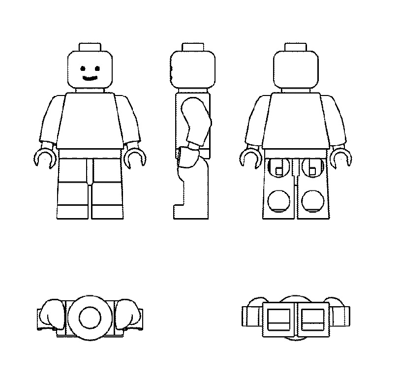
JPO Found Lego 3D Figure Mark Lack Distinctiveness

In a decision to the appeal against refusal to TM App no. 2017-138422 for the 3D shape of Lego figures in class 28, the Japan Patent Office (JPO) did not side with Lego Juris A/S and found the 3D mark is inherently descriptive and has not acquired distinctiveness in relation to toys.

[Appeal case no. 2019-13906, Decision date: January 6, 2022]

LEGO 3D Figure mark

Toy giant, Lego Juris A/S applied to the JPO to register a 3D mark, showing the Lego figure seen from the front, side, back, top, and beneath (see below), for “games and playthings” and other goods in class 28 on October 20, 2017.

Article 3(1)(iii)

Trademark Examination Guideline (TEG) pertinent to Article 3(1)(iii) of the Japan Trademark Law provides a mark shall be subject to the article if it solely consists of a shape that is recognized by consumers as a shape of goods or equivalent, namely “not go beyond the scope of the descriptive shape of goods”.

TEG stipulates criteria to assess the recognition.

  1. Where 3D shape is admittedly adopted for a purpose of enhancing function or the aesthetic appeal of goods, the shape is deemed to remain within the scope of descriptive shape of goods.
  2. Even though 3D shape has specific features by means of unique alteration or decoration, it is still considered not to go beyond the scope of descriptive shape of goods, where consumers assume such alteration or decoration attributable to enhancing function or the aesthetic appeal of goods.

The JPO examiner totally rejected the applied mark based on the article by finding the shape remains the scope of the descriptive shape of ‘human figure toys’ in class 28.

Lego Juris A/S filed an appeal against the rejection on October 18, 2019.


JPO decision

The JPO Appeal Board affirmed the findings of the examiner and found the 3D mark does not go beyond the scope of the descriptive shape of the goods in question by stating that:

  1. Plenty of human shape figures have been promoted for sale by competitors in relevant business field.
  2. There is less necessity to adopt specific configuration in making a human shape figure provided that it has a basic skeleton of head, body, arms, and legs.
  3. The Board has a reason to believe 3D shape of the applied mark is adopted enabling (i) to wear several caps and hair wigs, (ii) to get hold of various tools at hand, (iii) to stand still in display and play.
  4. If so, relevant consumers would assume the whole shape and its unique decoration of Lego figure attributable to enhancing function or the aesthetic appeal of the toy.

Taking into consideration that the actual 3D shape of Lego figures are considerably different from the applied mark, and the word mark “LEGO” has been constantly used on catalogs, packages, and advertisement material adjacent to the applied mark, the Board has a reasonable doubt if the 3D shape per se has acquired distinctiveness as a source indicator of LEGO toys.

Based on the foregoing, the JPO Appeal Board decided to dismiss the appeal in contravention of Article 3(1)(iii).

“MONA LISA” May Smile At You

In a recent decision, the Japan Patent Office (JPO) disaffirmed the examiner’s refusal and accepted for registration of the world-famous painting, ‘Mona Lisa’ by Leonardo da Vinci.
[Appeal case no. 2020-9377, Gazette issued date: May 28, 2021]


“MONA LISA”

Disputed mark, consisting of a wordmark “MONA LISA” written in a Japanese katakana character (see below), was filed by a Japanese company, Negibito Co., Ltd on February 20, 2019, for use on ‘edible live aquatic animals; edible unprocessed seaweeds; fresh vegetables; fresh fruits; live mammals, fish [not for food], birds and insects and other goods in class 32.

Apparently, the company uses the disputed mark on specially grown scallions with a high sugar content of more than 20 degrees to be sold at JPY10,000 (USD92) for one stalk!


Article 4(1)(vii)

JPO examiner raised her objection by stating that since “MONA LISA” has been known for the world-famous painting, ‘Mona Lisa’ by Leonardo da Vinci, it shall contravene the generally accepted sense of morality or the international faith if registered. Accordingly, the disputed mark shall be rejected in contravention of Article 4(1)(vii) of the Japan Trademark Law.

Article 4(1)(vii) of the Trademark Law prohibits any mark likely to cause damage to public order or morality from registration.

Trademark Examination Guidelines 42.107.05 provides seven criteria to take into consideration to determine if a mark, consisting of valuable cultural products (works of art), shall contravene the article.

(i) Famousness of the cultural products
(ii) Recognition of the cultural products among citizens or local residents
(iii) State of use of the cultural products
(iv) Relationship between the state of use of the cultural products and the designated goods or services
(v) Background, purpose, and reason for filing an application
(vi) Relationship between the cultural products and the applicant
(vii) Authorized entity that manages and owns the cultural products (if any)

The applicant filed an appeal against the refusal on July 3, 2020.


JPO Appeal Board decision

The Appeal Board assessed seven criteria pertinent to the works of art “MONA LISA” in accordance with the Trademark Examination Guideline.

The Board admitted a remarkable degree of recognition and reputation of “MONA LISA” among the general public in Japan as the world-famous painting by Leonardo da Vinci.

In the meantime, the Board questions if the goods in question are closely related to works of art and art exhibitions that the term “MONA LISA” has been used.

Besides, the Board found that the term is not used to promote or develop certain regions associated with the painting in relation to the goods in question.

Based on the foregoing, the Board held that it is unlikely that registration of the disputed mark would constitute a genuine and sufficiently serious threat to a fundamental interest of society when used in connection with the goods in class 32. Therefore, the disputed mark “MONA LISA” shall not be refused on the basis of the public policy exception provided for in Article 4(1)(vii) of the Trademark Law.

JPO rejects “AIR NECKTIE” due to similarity to NIKE “AIR”

The Japan Patent Office (JPO) dismissed an appeal filed by a Japanese individual who sought registration for use of the wordmark “AIR NECKTIE” on neckties in class 25 due to the similarity to NIKE “AIR.”
[Appeal case no. 2020-4106, Gazette issued date: February 26, 2021.]

AIR NECKTIE

The mark in question, consisting of two English words “AIR” and “NECKTIE”, and its transliteration in a Japanese katakana character (see below), was filed for use on ‘neckties’ in class 25 with the JPO on July 6, 2018 [TM Application no. 2018-88482].

TM App no. 2018-88482

AIR

The examiner raised her objection based on Article 4(1)(xi) of the Trademark Law by citing senior registration nos. 502137 and 4327964 for the mark “AIR” owned by NIKE Innovate C.V. (see below) which cover clothing, shoes, neckties, and other goods in class 25.

TM Reg no. 502137
TM Reg no. 4327964

Article 4(1)(xi) is a provision to prohibit registering a junior mark that is deemed identical with, or similar to, any senior registered mark.

Regardless of the arguments made on a written response to the office action by the applicant, the JPO examiner entirely rejected the “AIR NECKTIE” mark based on the ground.

On March 6, 2020, the applicant filed an appeal against the refusal with the JPO and disputed that the applied mark “AIR NECKTIE” is dissimilar to the cited mark “AIR.”

JPO decision

The JPO Appeal Board referred to the tests established by the Supreme Court ruling in 2008 to determine whether it is permissible to take out respective elements of the composite mark when assessing the similarity of two marks.

“Where a mark in dispute is recognized as a composite mark consisting of two elements or more, it is not permissible to assess the similarity of marks simply by means of taking out an element of the composite mark and then comparing such element with the other mark, unless consumers or traders are likely to perceive the element as a dominant portion indicating its source of origin of goods/service, or remaining elements truly lack inherent distinctiveness as a source indicator in view of sound and concept.”

Based on the tests, the Board found that it is permissible to take out a literal element “AIR” from the applied mark and compare it with the citations by stating the following grounds:

  1. The applied mark can be seen as a composite mark consisting of ‘AIR’ and ‘NECKTIE’ because of the space between two words.
  2. “NECKTIE” is unquestionably recognized as a generic term in connection with ‘neckties’ in class 25.
  3. Relevant consumers at the sight of neckties bearing the mark “AIR NECKTIE” would conceive the term “AIR” as a prominent source indicator.
  4. “AIR NECKTIE” does not give rise to any specific meaning in its entirety.
  5. The above facts suggest that “NECKTIE” lacks inherent distinctiveness in relation to the goods in question, and it would not play the role of source indicator of the applied mark in view of sound as well as concept.

Based on the foregoing, the Board affirmed the examiner’s rejection and decided that the applied mark “AIR NECKTIE” is similar to the cited marks as a whole given the remarkable similarity in sound and concept, even if the word “NECKTIE” differentiates two marks in appearance.